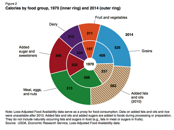
Marion Nestle describes this diagram as “my favourite figure”.

I hope she’s joking, because I can’t make head nor tail of it. ((Well, I can, but only with considerable effort.))
It’s from a USDA publication on U.S. Trends in Food Availability and a Dietary Assessment of Loss-Adjusted Food Availability, 1970-2014
Note, first, that the data are for food availability, which “serve as a proxy for food consumption”. So it’s measuring what’s there and saying all of it was eaten. Fair enough.
Inside the report are tables and graphs that are far more informative than that circular abomination — what are we even supposed to be comparing?
Marion Nestle concludes:
[C]alories from all food groups increased, fats and oils and the meat group most of all, dairy and fruits and vegetables the least.
While the report says:
Americans continue to fall short of the recommended amounts in USDA’s Dietary Guidelines for Americans for fruit, vegetables, whole grains, seafood, and dairy products, and their consumption continues to exceed the recommended amounts for total grains, some protein foods, saturated fat, and added sugars. In order to meet these recommendations, Americans would need to lower their consumption of added fats, refined grains, and added sugars and sweeteners, and to increase their consumption of vegetables, whole grains, dairy products, and fruit.
Go to it.